Thursday, 16 December 2010

Short list of potential ideas for didipak


The images of the sweets is a running theme throughout our videos and especially suits this time of year as they are candy canes and it is now christmas.

I really would like to incorporate this image on my digipak because I feel that it shows my artist having fun and enjoying herself. Also, it is very youthful as she is on a trampoline holding a bunch of flowers which could also be very girly - attracting a young, female audience.


 Once again, images of sweets would match our video and also the name of the album which is 'The Candy club'.

The barcode is essential to have on my digipak as it is what is seen on every single digi pak in stores.
This lasy picture is a long shot of my artist which i may put on the back of the digipak. I feel that it is a nice picture as it is very bright and shows that our artist likes to have fun.


Monday, 13 December 2010

Do's And Dont's Of Designing A Digi-Pack

 DO'S

  • Use a clear font
  • Use appropiate sizes for images and font
  • Use clear photos that are in focus
  • Use photos that are an appropriate shape for the page
  • Use a layout that follows the rule of thirds for composition
  • Make sure the font is clear from a distance
  • Follow Genre conventions
  • Follow the conventions of the 3 colour rule and use colour that is appropriate for Images, Font, Background
  • Use appropriate industry logos and conventions, properly positioned:
    Barcode
    Date
    Copyright
    Titles
    Artist Name 
  • DONT'S
  • Stretch the images, this will make them out of focus
  • Use layer styles
  • Use unnecessary effects, they must suit the genre
  • Place text across the artists face
  • Use a font simply because you like it
  • feel u need a seperate photo on every panel

Do's And Dont's for Design Work

 DO'S
  • Use a clear font
  • Use appropiate sizes for images and font
  • Use clear photos that are in focus
  • Use photos that are an appropriate shape for the page
  • Use a layout that follows the rule of thirds for composition
  • Make sure the font is clear from a distance
  • Follow Genre conventions
  • Follow the conventions of the 3 colour rule and use colour that is appropriate for Images, Font, Background
  • Use appropriate industry logos and conventions, properly positioned:
    Barcode
    Date
    Copyright
    Titles
    Artist Name 
  • DONT'S
  • Stretch the images, this will make them out of focus
  • Use layer styles
  • Use unnecessary effects, they must suit the genre
  • Place text across the artists face
  • Use a font simply because you like it
  • feel u need a seperate photo on every panel

Audience Feedback


Mock up Digipak


In class i experimented with a few shots and color themes for my digipak, i decided to do a four panel digipak with mostly close ups and midshots of Bella with a sweet theme going through out the four panels and bright girly colors. I think that this will go really well and represent the music video perfectly, the arrows represent were all the information will go.

Sunday, 12 December 2010

Research: three digipaks


This digipak relates to my genre as Pixie Lott is a pop artist. This album cover is from her first album, therefore, it is not suprising that it is mainly dedicated to the artists face - so that the audience/buyers can recognise her face and familiarise themselves with her. The background is similar to how I would like my own digipak to turn out as it is pink. I think that this is because many of her fans will be girls who would prefer lighter and girly colours such as pinks and purpers rather than more boistorous colours like bright reds and yellows. The font chosen for the artist's name is in white bubble writing which I think represents youth as most of her fans would be young and prefer the grafitti-style font than tradition 'New times roman'. Although the album name font does not stand out as much as the others, it is still very creative and gives the effects of little shinning lights which is reminiscent of a celebrities mirror with the light bulbs around it. I feel that this digipack relates to the genre and audience of my artist, Bella, as it is mainly pinks which attracts a young and girly audience which my artist appeals to.


Another digipack I have chosen to annalyse is Lily Allen's. It is very creative as instead of having a big image of the artist it is using the first letter of her name to attract the audience. The abrast image of her lying down in on her letter makes it more visually appealing for the audience and also reflects how creative Lily is as an artist. The boldness of the black, capital block letter 'L' on the pink background also makes the album stand out. The pinks used in the background and on her dress show that she is mainly aiming at a female audience and of a young age as her dress is not very revealing and quite girly. The font used for her name is bold and in black which makes it stand out and easy to read, whilst the album name is in ittalic smaller font with a pink outline which shows that it is not the most important aspect of the album. This digipak relates to my audience and genre as I feel that it attracts a mainly feminine audience because of the use of pink colours and the mise en scene and costume that Lily wears which suits most young girls today.


The Saturday's album cover for 'Im Missing You', I feel, suits my genre as it would appeal to a young and female audience. The image on the cover ties in with the name of the album, 'Im missing you', as it almost looks postcard-like - with an image of girls lying down on a beach looking like they are having a good itme. This would appeal to my audience as they can relate to having a good time on holiday and enjoying the sun (it is also something you would expect to see on a postcard in a tourist shop). The font used on this cover is very clever as it relates to the overall theme of the cover - sand. It is the group name and song name written into the sand which every girl can relate to when being on holiday (writing things with a stick or their fingers in the sand). The overall theme of the cover also relates back to their actual music video which is set on the beach and having them in beach outfits. This relates back to my genre and audience as it is an all-girls group and would attract many female viewers/buyers because of the strong feminimity themes running through the cover.


Do's and Don'ts of Design Work


  • To use a clear font
  • Use appropriate sizes for Images and Font
  • Use clear photos that are in focus
  • Use photos that are an approriate shape for the page
  • Use a layout that follows the rule of thirds for composition
  • Use an appropriate type face that follows Genre Conventions and A House Style
  • To be aware of where I will place the font, it must follow Genre Conventions and to Be Clear From A Distance
  • Follow the conventions of the 3 colour rule and use colour that is appropriate for Images, Font and Background
  • Think carefully about how I will use and intergrate font, text, language and Image
  • Use appropriate industry logos and conventions, properly positioned    Barcode Date Copyright Titles and Artist Name
  • Make sure you present the artist's name and album name on the side of the digipak


  • Stretch images, this will make them out of focus

  • Use layer styles

  • Use unnecessary effects. Any effects used MUST suit the genre

  • Place text across the artist's face

  • Use a font simply because you 'like it'

  • Feel you need a seperate photo on every panel  BE CREATIVE

  • Forget to include improtant aspects of a digipak including: artist name, barcode, copyrights, website

    • 

    Design Activity..Lesson 31

    In this lesson we were given a tutorial on who to use the programmes Photoshop and Quark to create our digipaks. I found this very useful as although we were given a tutorial last year, I was able to refresh my memory and add to the knowledge of the programmes that I had gained before hand.

    We were shown how to create effects which changed the colour of the image, made the image distorted and put shapes on to the image - which all in all made the image appear more visually interesting and different than it's original. We also learnt how to rotate the image, crop and resize which would help us to make adjustmenst to the image that we want to use on our digipaks so that they are exactly how we want them to be.

    We were shown a range of texts in which we could include on our digipaks and it showed me that we are not restricted at all and have the freedom to create a completely new look for a digipak and think 'out side the box'. Overall, I found this tutorial helpful and know that it will help me create an outstanding digipak which links to my music video.

    Monday, 6 December 2010

    Digipak Mock-Ups.


    These are some rough ideas I did in class today for my digipak. The arrows indicate what will go where (for example where the barcode, tracklists, copyright information and record label logo will be placed). I have decided to do a four panel digipak because I have a consistant theme running through of sweets I think it will be too much and over the top if I carry it on for more than four panels.
    I think my rough ideas for my digipak work because it relates to the video it has the same on going theme.
    There are close-ups to of my rough ideas so people can see what it would like if they were holding it, and too see the writing and detail.
    (Im calling my artist Bella and I might call the album B)

    Digipak Mock Ups- and Advertisment Mock ups


    These are just rough ideas that our group put together. It incoporates all of our own ideas into one and as you can see it has an consistant theme running through it.

    Digipak Mock-Ups.


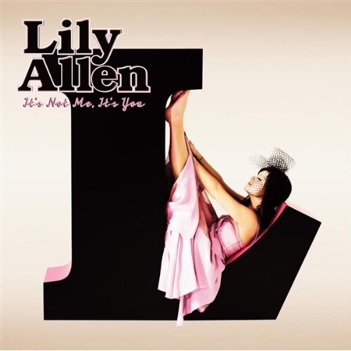
    Here is a mock-up of my digi pack. It gives a brief overview of how I'd like my digipack to turn out. I am using the colours of pinks, reds and purples which stick to the overall 'girly' theme of our video and how our artist behaves. On the front I have chosen to have the artist's name, Bella, in bold as she is a new artist so we would want people to familiarise themselves with that name as soon as they see the digipak. Also I want images of sweets and a big image of my artist holding a lolly pop as I feel that it sticks matches one of the outfits that Bella wears in the music video - a corset made up of sweets. The continous occurance of sweet images also ties in with the name of the album which is 'The Candy Club'.

    On the back of my digipack, I will put images of the Bella infront of the coloured doors in a row which will link back the the beginning of the music video where there are fast edits of Bella standing infront of different coloured doors. I will also try and put the track list in a over sized image of a lollypop inorder for the theme of candy and sweets to run throughout the whole digipak. Colours and font will be pinks and itallic as I feel that it reflects a more feminine side. The back cover will also hold the barcode, record label logo, copy rights and website of the artist - the back will hold all the main information.

    In the inside of my digipak, where the CD will be, I have decided not to place an image of my artist behind the CD but instead I will put an image of her lips which has sprinkles stuck on to them. This is because we used the same idea in our music video as she sang the chorus. There will also be images of sweets and
    lollypops surrounding the CD.

    On the other side of the cover, I have decided to put another image of the artist eating sweets decorated with pinks, purples and more sweets. Then in a red/pink bubble is where I shall put my 'thankyous'.

    Digipak Mock-Ups.


    Monday, 29 November 2010

    Design Activity-Lesson 31

    This lesson we had a tutorial about using Photoshop and Quark, i found it confusing but hopefully when i go over it, it will be much easier than today.
    I learnt how t do do things like using effects and text to make a photo look better and crop it too fit the sizeof my different panels on my digipak.
    However the lesson slowed down a bit when I found out my final edit hadn't been uploaded and then wrong video had then been  uploaded (This was neither my groups or my fault).
    Hopefully this can be fixed before the whole projected is marked as I do not want too loose marks seeing as we have put so much time and effort into making what I feel is a good pop video.

    Design Activity.... Lesson 31

    This lesson we had a tutorial on how to use photoshop and quark. It was not helpful. I did not really learn much as i already was put through a tutorial last year. Personally i found that it was a waste of valuable time, and i could have been planning other things that will help me get a better grade in my coursework.  


    On the contrary, it did help me refresh my mind on what to do. 
    BUT!!!!!


    I Found out that the wrong version my final edit was uploaded. This disheartened me as i spent all my lunch times in workshop making that video as perfect as i could..  (This was not myself or groups fault as we had no control of which video was uploaded. but hopefully this can be fixed in time) 

    Design Activity-Lesson 31

    In this lesson we learnt how to use photoshop and quark for our pop video digi paks

    Thursday, 25 November 2010

    Analysis Of One Sequence From The Rough Cut Video.


    The sequence we have chosen to analyse is the sweet scene when our artist Bella is lying on a bed of sweets and we quickly wanted to analyse some of the shots that were too fast when they were edited. Initially we used the green screen to make the background completely black but when it came to editing out the green screen some of the colours on the bed and the artist Bella would dissolve, we then decided to re-shoot without a green screen and use a black curtain instead. When re-filming, we pulled the black curtain all the way and rolled the green screen all the way up so that it was out of the way. This allowed our new shots to have a black background which made our artist, Bella, stand out more with her sweeties corset. To make the shots that were edited too fast look better, we cut some of them to put in some shots we already had that were longer.

    Off Set Videos


    These are our off set/behind the scenes videos introducing our locations and our up and coming star Bella. Each video is a different location of where we shot the pop video and what our artist was wearing.
    (One of our videos has come out upside down we've tried to change it but it can't be edited in final cut pro)

    Thursday, 18 November 2010

    Final Rough Cut And Feedback

    This is Group Ones Final Rough Cut . . . .
    This is the final rough cut video overall the video is a succsess but there are some flaws, however these are easy to ammend.
    For one base track's we used the green screen thinking that we dissolve the colour when it came to editing, but when we tried to edit out the green screen our star Bella and some of the colourful props where disserpering aswell. To fix this we just need to redo the shots this should take about an hour because we took pictures whilst filming, so we can just copy the mise en scene and instead of using the green screen use the black curtain instead.
    During the video some of the shots are too quick, so we have decided to either make the shots longer or cut them completley depending on the length of the video when we re-shoot one base track.
    Even though the camera work is steady throughout some of the shots are out of frame and too fast, but these can all be fixed in final cut pro, we just need to frame the shots and cut out the extra space in the back of the shots.
    When these minor errors are all fixed the final video will be...BOOMBASTIC!!!!

    Sunday, 31 October 2010

    Vladmirr Propp


    Vladmirr Propp was a Russian Scholar who analyzed the Russian folk tales. He did this by breaking them down into 31 components which consisted of a hero, villain, confrontation between the two and eventually a resolution. A music video which I feel that I can apply his theory to is Mariah Carey - Heartbreaker. This follows his theory as it begins with 'absentaion' where the heroe (in this case 'heroin' who is Mariah Carey herself) leaves her comfort zone as she suspects that her boyfriend is cheating on her, so she is seeking with her friends to catch him in the act. This then leads to the stage of 'interdiction' where the hero is warned against something (dont go there). In this case Mariah is sitting in her car contemplating whether she should go into the cinema and confront her boyfriend, however, she is egged on by her friends and chooses to do so anyway. The 'violation of interdiction' is where the villain is introduced and in this case it is her boyfriend watching the film with another woman which indicates that he is having an affair.

    Jumping a few of the steps, the music video then leads to the 'first function of the donor' where the heroe is attacked by her boyfriends 'other' girl in the toilets as she goes to confront her. She then reacts which leads into the 'struggle' where the villain and heroes join in direct combat - they have a massive fight in the girls toilets. 'Victory' is then gained as Mariah 'returns' back to the cinema once again which obviously means she has defeated the other girl and 'returns' to the other 'villain' who is her boyfriend to lead to his punishment. She is then faced with a 'difficult task' as she now has to confront her own boyfriend about his dirty deeds and he is 'exposed'. She is given a new 'appearance' as she is holding a drink which she then pours onto her, now, ex-boyfriend as 'punishment' for having an affair on her. In this case, the 'wedding' of the story is her happy ending of walking away from a relationship where she was not being treated with respectand honesty.

    Locations


    Our chosen location is in Camden Passage. This is very local to our college which means that we can film on the go and re-do clips if it is necessary quite easily. Also, the passage is not too crowded which makes filming more easier for us as we have less disturbances and people getting in our way and nicer for the public as we will not be inconveniencing anyone on their day. We plan to film in certain shops which suit our theme of 'pinks' and femininity, however, to do this we will ask permission of all shop owners before doing any filming.

    Thursday, 14 October 2010

    1st Ideas For Digipaks


    These are some rough mock up ideas of images and texts that I will use on my digipak. In the digipak i have the main concepts that will be in the pop video, such as several images of the new artist Bella, images of hearts and girly things, the main colour pink and the main lyric from the song, "I just want your kiss".
    These digipaks are all consistent they all have the same theme, these are only rough and made on powerpoint but my real digipaks will be made on Quark and i will have 4 panels.

    Digi Pack


    I was looking into doing a 6 plan digi pack, but i might result in doing a 4 pannel pack.  I want to create a flow of pink green coral and bright floral colours throughout the pannels and get a good range of angles of Bella's face and body especially the lips. It will contain information on the artist and record company, a good range of images, barcodes etc. The didgi pack will attract an audience that is really into girly stuff, romance, playfull, sexy and cute at the same time. This will attract a lot of female attention. The image above is just a breif look into how i want the images to look like and colours, in my actual digi pack ill inculde all the essentials.