
This digipak relates to my genre as Pixie Lott is a pop artist. This album cover is from her first album, therefore, it is not suprising that it is mainly dedicated to the artists face - so that the audience/buyers can recognise her face and familiarise themselves with her. The background is similar to how I would like my own digipak to turn out as it is pink. I think that this is because many of her fans will be girls who would prefer lighter and girly colours such as pinks and purpers rather than more boistorous colours like bright reds and yellows. The font chosen for the artist's name is in white bubble writing which I think represents youth as most of her fans would be young and prefer the grafitti-style font than tradition 'New times roman'. Although the album name font does not stand out as much as the others, it is still very creative and gives the effects of little shinning lights which is reminiscent of a celebrities mirror with the light bulbs around it. I feel that this digipack relates to the genre and audience of my artist, Bella, as it is mainly pinks which attracts a young and girly audience which my artist appeals to.
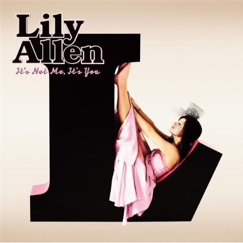
Another digipack I have chosen to annalyse is Lily Allen's. It is very creative as instead of having a big image of the artist it is using the first letter of her name to attract the audience. The abrast image of her lying down in on her letter makes it more visually appealing for the audience and also reflects how creative Lily is as an artist. The boldness of the black, capital block letter 'L' on the pink background also makes the album stand out. The pinks used in the background and on her dress show that she is mainly aiming at a female audience and of a young age as her dress is not very revealing and quite girly. The font used for her name is bold and in black which makes it stand out and easy to read, whilst the album name is in ittalic smaller font with a pink outline which shows that it is not the most important aspect of the album. This digipak relates to my audience and genre as I feel that it attracts a mainly feminine audience because of the use of pink colours and the mise en scene and costume that Lily wears which suits most young girls today.

The Saturday's album cover for 'Im Missing You', I feel, suits my genre as it would appeal to a young and female audience. The image on the cover ties in with the name of the album, 'Im missing you', as it almost looks postcard-like - with an image of girls lying down on a beach looking like they are having a good itme. This would appeal to my audience as they can relate to having a good time on holiday and enjoying the sun (it is also something you would expect to see on a postcard in a tourist shop). The font used on this cover is very clever as it relates to the overall theme of the cover - sand. It is the group name and song name written into the sand which every girl can relate to when being on holiday (writing things with a stick or their fingers in the sand). The overall theme of the cover also relates back to their actual music video which is set on the beach and having them in beach outfits. This relates back to my genre and audience as it is an all-girls group and would attract many female viewers/buyers because of the strong feminimity themes running through the cover.
No comments:
Post a Comment