The dominant visual image in all of my groups digipaks and adverts is our artists Bella, this is the same in our video Bella is the main "attraction" the video is mainly about her.
Our target audience would be attracted to our digipaks and adverts because they contain a lot images from the video itself, so if they enjoyed the video then they will enjoy the related products.


The video has one major theme, femininity. The ancillary products clearly show this, because like the video everything is the same. For example the colour theme of pink, black, purple and white, the props sweets and make-up and they style of the artist doesn't change either.


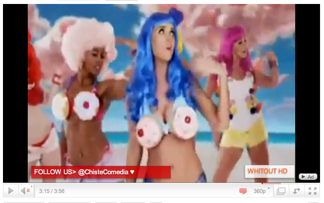
As stated in my previous blogs Katy Perry's song 'California girls' gave us some ideas as to how we could use different props to make our video more girly.

The texts on both my digipak and advert are I think successful and useful because they give the target audience the right amount of information they need to know about the artist, her music label and how to acsess her music. Also the design and colour of the font is pleasing to the eye so this my even be the main reason people wpuld be interested in reading the text about Bella, the record label, etc.
Because our target audience is young 'girly' girls interested in pop music and the latest technology the information on my advert I think will attract them into buying Bella's CD.

(The is a screen shot from my advert, most of our intended audience would be familiar with Choice Fm radio station, and almost defintley own an Ipod so this text is successful in 'reeling' in a bigger fan base)

(This is a screen shot from the back panel of my digipak, it's just basic information about Fiction record label )
(This is a quick video of me answering question 2 in the evaulation)
No comments:
Post a Comment