How Effective Is The Main Product (Video) & Ancillary Texts (Digipak And Advertisement)?
When it came to creating my video, I had to think about how I could link my video with my Ancillary Texts. This was key, as I needed my main product to be recognised by the Ancillary Texts and the Ancillary Texts to be recognised in the Main Product.
This was not difficult as the theme for our video was so straight forward, as long as I included these in my Ancillary Texts, there would be a link between them both.
In both (Main Product/Ancillary Texts) I have made the theme of pink the most dominant.
Here above are shots from the music video and my digipak. Here it is made clear that there is a link between the video and the digipak due to the consistent theme of pink.
This is a collage I made in photoshop, showing all the technologies I have used. I have shots of me filming with the camera which I used to film the entire video and other clips my group and I made realating to our project. Theres images of the tripod this was used to get a level steady shot whilst filming, and film from heights that I couldn't reach. Theres images of internet based technologies such as YouTube to research videos and add links to my blogs, Blogger this was essentially the backbone of our project because it allowed me to meet deadlines of coursework, show the progress of my work and actually show work that I've produced and Google to get photos and research relevant information. Theres images of programs such as Final Cut Pro to edit and create my video, this year we used Final Cut Pro in a more advanced way by adding the base track, using marking the base track so the lip syncing look good and accurate, I used the razor tool to edit my base track and delete certain clips I didnt want to use in the final video. I also learnt how to convert the videos I made on Final Cut Pro into Quicktime videos so I could easily uploaod them to my blog (I would mark the begging and end of my video with I and O for input and output, then I would export it using quicktime conversion, change the size to 160x120 and save it) If this didn't work I would use a new tool on the apple mac called Handbreak, were I could convert the quicktime film into an MP4 video and then upload to my blog witihin seconds.There are images of Photoshop I used this program to create my advert and edit photos I mainly used the crop tool to take parts of an image I wanted, there is an image of Bella in my collage with white spaces around her, this was me using the magic wand tool in photoshop to edit the background out of the image so I could use the the image on my digipak.There are also images of Quark Express I quickly used Quark to get the template for my digipak. There is an image of my group using the green screen, however we decided to cut the green screen out of our video and use a black curtain instead so we did not use the chroma keying. Using the Apple Mac it's self is another form of technology I used because it is a very advanced computer, I used the Mac for about 95% of my work.
This is the animatic story board my group and I made, I added it to this blog too show the different types of technologies I have been using, and what I am using them for. We used Final Cut Pro to make this animatic storyboard, we just grabbed still images onto the timeline in the order we wanted them and added our main base track to create it.
(This is a quick video of me explaining evaluation question 3)
How effective is the combination of your main product (video) and ancillary texts (digipak) and advertisement)?
When creating my music video I had to consider how I could create links and relations back to my digipak. This meant that I had to consider the themes within the video which could be placed on paper and would still suit my target audience - young females. I feel that I have achieved this as there is a definite link between my video and digpak through many different aspects which I shall explain now.
On the left is a cropped print screen of the front cover of my digipak and on the right a print screen of a clip in my video. I have chosen these two as it shows that I have kept a link between the two by using the image of the large lolly pop. In the video she holds an oversized lolly pop with a candycane print on it and so I have decided to place a similar image on the front of my album cover. I created this by taking a picture of candycanes and enhancing the colours by turning the once red candycanes to pink. I then used to cutter tool and selected the shape of the lollypop to cut out a lollypop shape out of the candycanes. I feel that the audience will recognise a link as the pink image of the lollypop relates to the pink and sweeties theme which is continued throughout the video. The target audience will also be attracted to them as they represent sweeties bring about a fun and sweet atmosphere which is what young girls are all about (and pop videos/aritsts).
Within our video, Bella constantly blows kisses and pouts her lips. This is because the main lyrics of the chorus is 'I just want your kiss boy', so the kisses relate to that. Also, it is corellated to love, girls and young relationships which is what our target audience experiences and is all about. On the left is a screen shot of our Bella blowing a kiss in the video and to the right is an image used on my digipak of Bella blowing a kiss. My audience will be able to recognise that my artist consistently blows kisses throughout the video therefore it is bound to turn up on my digipak. It shows that I am trying to maintain the notion of blowing kisses and love in my digi pak aswell as my music video. Also, the costume worn in both medias are similar as is wearing pinks. I feel that this will attract the target audience of young females as pink is usually associated with 'baby girls', love and candy.
I have used these images to illustrate how I've continued a link between my two medias using images and colours schemes. In my video, the pinks colours are very evident and are used on her makeup, costume and props. Therefore, it felt only right to make the main colour used on my digipak and advertisement 'pink'. This image is from my poster and as you can see I have used pink and swirly font on a pink background. This is simialr to the pink cardigan which Bella wears in some clips of the music video. This would be recognised by the audience as the pink in the video is not hard to miss and will attract my female audience as it looks very girly and pretty.
Another link which I feel I have made between my ancillary texts and music videos is the use of large amounts of sweets. In the music video Bella is wearing an original corset with sweets stuck onto it and is lying on a table full of sweets and pink objects. To create a link with my ancillary texts, I used to cookie cutter tool to cut out shapes of lips, candy canes and hearts from an original images of candycanes. This shows that I have creatively incorporated the theme of lots of sweets in my ancillery texts as well as my music video. The audience will be able to recognise the 'sweetie' theme as the album is called 'Candy Cane' and also there are many clips of Bella on the sweetie table, therefore, the cutout candy cane shapes would be recognisable and relatable for the young female audience.
I have selected this image to show the extent we went to to carry out this 'pink' theme. Here it shows how much we thought about the target audience, which is young girls and other pop videos, as the colour schemes are very dominant and strong. Everything's PINK ! If that doesn't shout out 'girly pop video' then I don't know what will.
Links from previous digipaks, music videos and posters can be seen in my own work. Mostly following the female pop artists with their use of pinks, many images of the artist and funky/bright colours to keep the audience engaged.
In what ways does your media product use, develop or challenge forms and conventions of real media products...
KATY PERRY - CALIFORNIA GIRLS
We were influenced by the girl nature of this video and how it looked fun and energetic. We felt that this video would be a good one to analyse and help create our very own music video as it portrays the artist as very girly, fun and sexy.
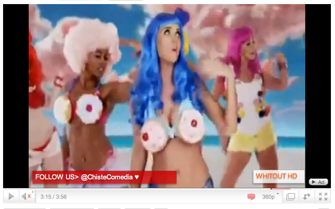
The mise en scene of the video especially influenced us as it was spectacular. The scene was decorated with giant sweets, chocolates and cakes. The mise en scene created a dream world which drew in a very young and female audience which was what we would have liked to achieve.
The costumes used in Katy Perry's 'California Girls' was very creative using silky materials of pastelly, but mainly pink, colours. Also, there were parts where food had been moulded into the design on the dress such as ice creams and sweets which is what all teenage girlsl ove to eat. We used this idea to influence one of the costumes our Bella wore. We decorated a corset with sweets by sticking jelly beans and a variety of other colourfuk sweets on the top. We then finished the outfit with a pink tutu and pink cardigan. This was conventional as it followed Katy's costume in her video which was aimed for girls and feminine audience. We also got Bella to lie on the table which was surrounded by girly things - sweets, pink iPhone, makeup, iPod, lipgloss and pink cloths. This made everything seem very youthful and attract a younger audience as they can relate to using technologies such as iPhones and makeup. This was conventional to Katy lying on the pink clouds which were reminiscent of candy floss which is also another sweet and is something found at fun fairs and associated with children and youth.
The props we use in our video are reminiscent of the props used to decorate the scenery of Katy's video. These included large lollypops and bunches of flowers. This is similar to the giant candy canes and lollypops used in Katy's video. We thought that this showed our artist's sweet side and her innocence and sweetness as a new coming artist. This also linked to the candy cane theme which I have used throughout my digipak and advertisement.
The section, in our music video, where we filmed an extreme closeup of Bella's lips with hundreds and thousands stuck onto them is conventional to Jessie J's 'Like a dude' video. However, Jessie challenged the conventions of a normal pop genre video as she used a black lipstick to stick on the black spikes on to her lips which, as a result, created a very fierce and dark look. Whereas, we decided to stick with the bright and fun themes of pop videos by sticking hundreds and thousands on to her lips which created a more colouful and girly effect. We also was influenced by the camera work of this shot as it was an extreme close-up of her lips which we thought would make our video look creative as we are drawing in all attention to her unusual lips which emphasise the fact that our new artist is 'sweet' and 'hip'.
My digipak was influenced by these two digipaks.
KATY PERRY - I used the plain white background from this digipak and bright bold picture of the artist so that all attention is on them (as they are a new artist). Also the use of hot pinks and her pink dress really emphasise her girlyness and stand out on the whitebackground. The font used for her name is bubble writing which already shows youth and attracts a younger audience. However, I decided to use a itallic font called 'Zapfino' which challenged the conventions of youth as it looks more sophisticated yet still keeps the feminine manner of the artist.
BRITNEY SPEARS - This is Britney Spear's first album and I thought that it would be a good digipak to look at as she is a pop singer like my artist and it would be Bella's first album too. It is very similar to mine in the fact that the front cover is very simple and plain - it has a plain white background and mostly dedicated with a midshot image of the artist. I feel that this is not very conventional to most pop covers as it doesn't show off the glamourous lifestyles a popstar holds, however, I chose to challenge this as it puts all focus on the image of the pop star inorder for her to become familiar with the audience.
Like all digipaks mine contains a barcode, record company information, website, record label and track list on the back cover.
I used ideas from both these posters to help create my own. The first poster shows the font being used from the actual digipak therefore I decided to incorporate my font used in the digipak on my poster too, so that there was a running theme throughout. I also, felt that the lip print in the first poster was very symbollic of her first song 'I kissed a girl' and would be to Bella's song 'I just wanna kiss you'. Therefore I used lip prints to decorate my poster, however, I decided to make it look more visually interesting but filling them out with a 'candy cane' print which refers to the actual name of Bella's album. I feel that these are conventional to the genre of music as it makes you use a lot of red and pink colours which are usually associated with girls who is the main audience of both popstars. The second poster has the logos and names of all it's sponsors and where you can purchase tickets for the event, therefore, I have included the stores in which you can purchase Bella's album at the bottom of my poster. THis holds conventions of real life advertisements as it is what would be seen on them so that the audience knows how to get hold of the album.
KATE NASH - PUMPKIN SOUP
Although, this is the actual video which goes with the song we have chosen we were very influenced by the fast edit cuts used at the beginning of the video. They quickly cut to another image on each bet. We used this idea by making quick cuts on different colour doors on each beat until our artist appeared. I feel that this went well with the music and therefore created a successful visual element to our video that made viewers want to continue watching it.
HERE ARE OUR FAST EDIT CUTS AT THE START
DIRECTORS COMMENTS
Another convention which we considered was many closeups of our artist Bella. This is to establish a relationship with the audience and so that they can familiarise themselves with her and therefore recognise her in the future. Also, the many closeups of Bella illustrate her 'star status' and that she is the main attraction of the music video/digi pak.
We also used Andrew Goodwin;s theory of Amplification, where we took the main themes of love and kisses and performed it in our music video. We did this by using pinks and red colours which are usually associated with love. We got members of the public to perform acts of love; i.e. kissing and blowing kisses to the camera. I feel that this showed the theme of love and got members of our audience involved which created a more enjoyable atmosphere.
Although I talk about my products following a theme of love, pink and sweets which attract a largely female audience, I feel that we could also attract a male audience due to the fact tat we really sexualised Bella. There were sexual connotations to her costume as it was quite revealing (cleavage and legs) and the way she behaved. This would attract a male audience as they would think that the artist is attractive and would want to see more of her work as she'd be on it.
These are a couple on-shoot photos of Bella. The poses and her sitting on the dog in that position has many sexual connotation and makes her appear more attractive to male viewers.
I think our video was sucessful because there is a very clear link between it and it's ancillary products.
The dominant visual image in all of my groups digipaks and adverts is our artists Bella, this is the same in our video Bella is the main "attraction" the video is mainly about her.
Our target audience would be attracted to our digipaks and adverts because they contain a lot images from the video itself, so if they enjoyed the video then they will enjoy the related products.
(The top screen shot an image taken 24seconds into our pop video, and the second image is an advert, the artist dace is exactly the same, so it shows the product links with the video. The artist Bella has a recognisable face on all products she associated with)
The video has one major theme, femininity. The ancillary products clearly show this, because like the video everything is the same. For example the colour theme of pink, black, purple and white, the props sweets and make-up and they style of the artist doesn't change either.
(The top screen shot is an image taken 2minutes and 58 second into our pop video, and the second is a screen shot of an image taken from the inside of my digipak. The artist style doesn't change and is consistant in her videos)
As stated in my previous blogs Katy Perry's song 'California girls' gave us some ideas as to how we could use different props to make our video more girly.
(The top image is a screen shot taken from Katy Perry's Califronia girls 3minutes and 15seconds in, the bottom screen shot is an image take from the back panel of my digipak. Although the cakes are not used the same, the concepts are the same. So not only does our video and it's products link so do other pop artist)
The texts on both my digipak and advert are I think successful and useful because they give the target audience the right amount of information they need to know about the artist, her music label and how to acsess her music. Also the design and colour of the font is pleasing to the eye so this my even be the main reason people wpuld be interested in reading the text about Bella, the record label, etc.
Because our target audience is young 'girly' girls interested in pop music and the latest technology the information on my advert I think will attract them into buying Bella's CD.
(The is a screen shot from my advert, most of our intended audience would be familiar with Choice Fm radio station, and almost defintley own an Ipod so this text is successful in 'reeling' in a bigger fan base)
(This is a screen shot from the back panel of my digipak, it's just basic information about Fiction record label )
(This is a quick video of me answering question 2 in the evaulation)
In what ways does your media product use, develop challenge forms and conventions of real media products?
This is the song my group chose to recreate, Kate Nash - Pumpkin Soup.
There are certain video's that have helped influence our video.
For example; here we have a lip scene from an artist called Jessie J. This is her song "Like A Dude". We took the more girly approach though and used sweets instead of black diamonds.
Another example is the sweet outfit in Katy Perry's music video, "California Girls". We thought that the theme of sweets should stay dominant in our video as it represents the 'Sweetness' of a girly girl.
Here is Rihanna's music video to "Only Girl In The World". Here we have incorporated the floral imagery and the pink colours. This adds to the girly flow and helps make our theme more dominant.
Here is a video by an artist called Ke$ha, of her song "Tick Tock"
I embedded this video because I believe although the videos are contrasting, they still do attract the same audience. Also some of the camera shots are similar of those to ours.
On the other hand, our artist also attracts a male audience, due to the 'sex appeal' Bella carries. This was coincidental BUT the affect that she has on the male audience can be seen as beneficial. This is due to the fact that it will attract a wider audience and could benefit sales etc.
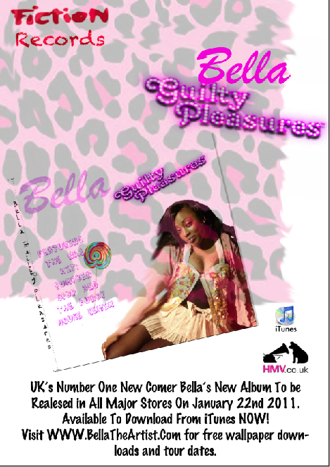
Above is my final advert. Here I have taken the theme of pink and used the same text, font and ideas as my digi pack to attract people to it. I believe that doing this will 'brand' my artist so that when people see pink leopard print the think 'Bella'.
Above is my digi pack and below is the front panel of Nicki Minaj's album "Pink Friday". I used Pink Friday as a sort of stimulus to create a barbie pink girly theme. I took the pink and the font from her album and used that in mine.
Intially this video by 'Kate Nash-Pumpkin Soup' influenced our final video, it was not only the song, but the mise en scene, the movement of the singer, and some of the camera angles and shots.
24seconds into this video the camera tracks in towards Kate Nash, in the beginning of our video the camera tracks into Bella laying on the bed then tracks up her body revealing her outfit the the general theme of sweets. The femininity (coloura, gestures, props) of mise en scene guided us to develop our video, and think about our target audience.
The top lips are a screen shot from 'Jessie J-Do It Like A Dude' video, and the bottom lips are a screen shot from our final video. We decided to copy the concept of things stuck on the singers lips, but we developed the idea by toning it down and make it more girly so it would fit in with our genre.
The top screen shot is from 'Katy Perry-California Girls', and the bottom screen shots is again from our final video. We decided to incorporate some of her body movements into our video because both the videos have certain aspects in common like sweets and pink colours. We obviously had to tone down our artist, so we matched her outfit with the props and unlike the California Girls video we didn't use any editing or green screen to add extra things, so we copied the position Katy Perry was in but made it less sultry and had Bella lie on a bed of sweets instead.
This is my final didgipak I got my inspiration from both Rihanna's and Katy Perrys Cd cover, I like the way on Rihanna's 1st panel it's just a dominant photo of her, and on Katy Perry's 1st panel her name is the most dominant visual aspect. By mixing these two ideas I produced a similar 1st panel, but it has it's own features for example the writing is all the same colour, all the same font and the background is all one colour through out. Also like Katy Perry's didgipak I have a consistant theme running through.
This is my final advert I got my inspiration from the Rihanna and Katy Perry digpaks I looked at, I wanted my my advert to be very similar, almost identical to m y digipak so that if someone who was looking for the Cd would immediatley recognise this Cd because of the advert.
(This i just a quick video I made discussing evaluation question 1)
We used developed and fully exploited the use of pop generic codes to appeal to our target audience, not only that we managed to appeal to a male audience aswell due to the 'sex appeal ' Bella has (E.g- lying on a bed of sweets in a corset made of sweets and her chest area is exposed but not in a sultury way). Everything you would expect to find in a typical girly video is in our video. We new it would work because the pop market is still growing and a lot of artists are associated with pop music. I believe the video fits with Andrew Godwin's theory of Amplification, the video introduces new layers of meanings such as femininity, sweets and "girly sillyness", but it does not contradict the meaning of the song, there is still an element of love in the video as there is in the lyrics (E.g- when the boy and girl kiss in the video, and hearts drawn on Bella).
Also our digpaks and adverts have a pop girly theme on them, so it's not like we made a pop video then the adverts and Cd is different everything is consistant so it would sell more.